Aura Display
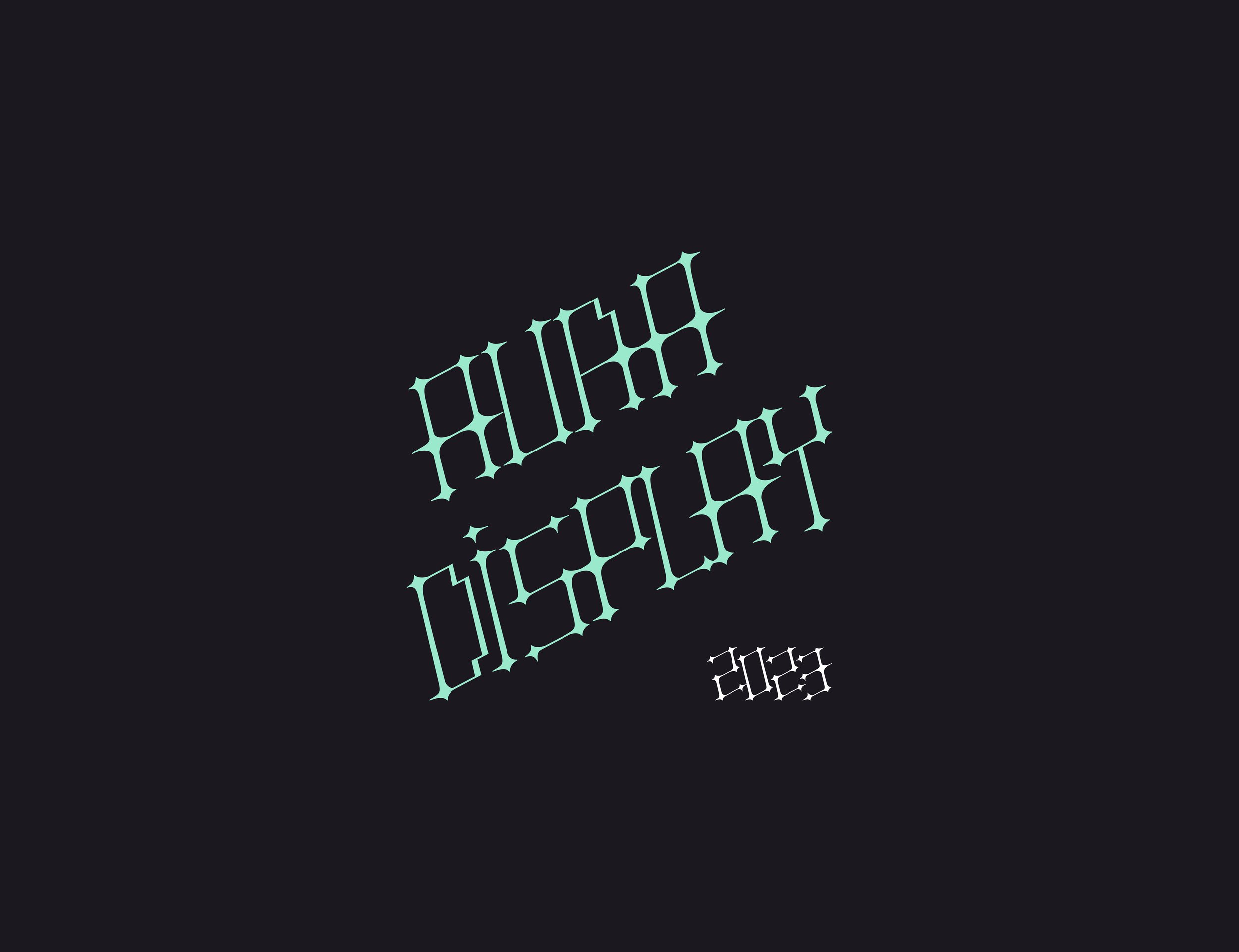
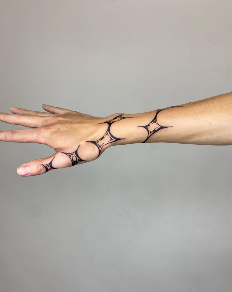
Aura Display is a low contrast, medium weight, serif font with a faux italic baseline. The font was inspired by the tattoo style, “freehand auric shields”, as coined by San Francisco-based tattoo artist Saint (@thankyousaint), and modular fonts such as Radioland. The modular typeface contains points of alignment in which the font’s letterforms can serve as “building blocks”, allowing for the typeface to be very versatile for layout.
“Freehand Auric Shield” Tattoos by Saint (@thankyousaint)Sketching
Iteration
Prints from Second Round of CritiqueThe image below depicts all of the changes I made to my letterforms throughout the critique process. These changes made the font more cohesive, legible, and balanced.
Type Specimen
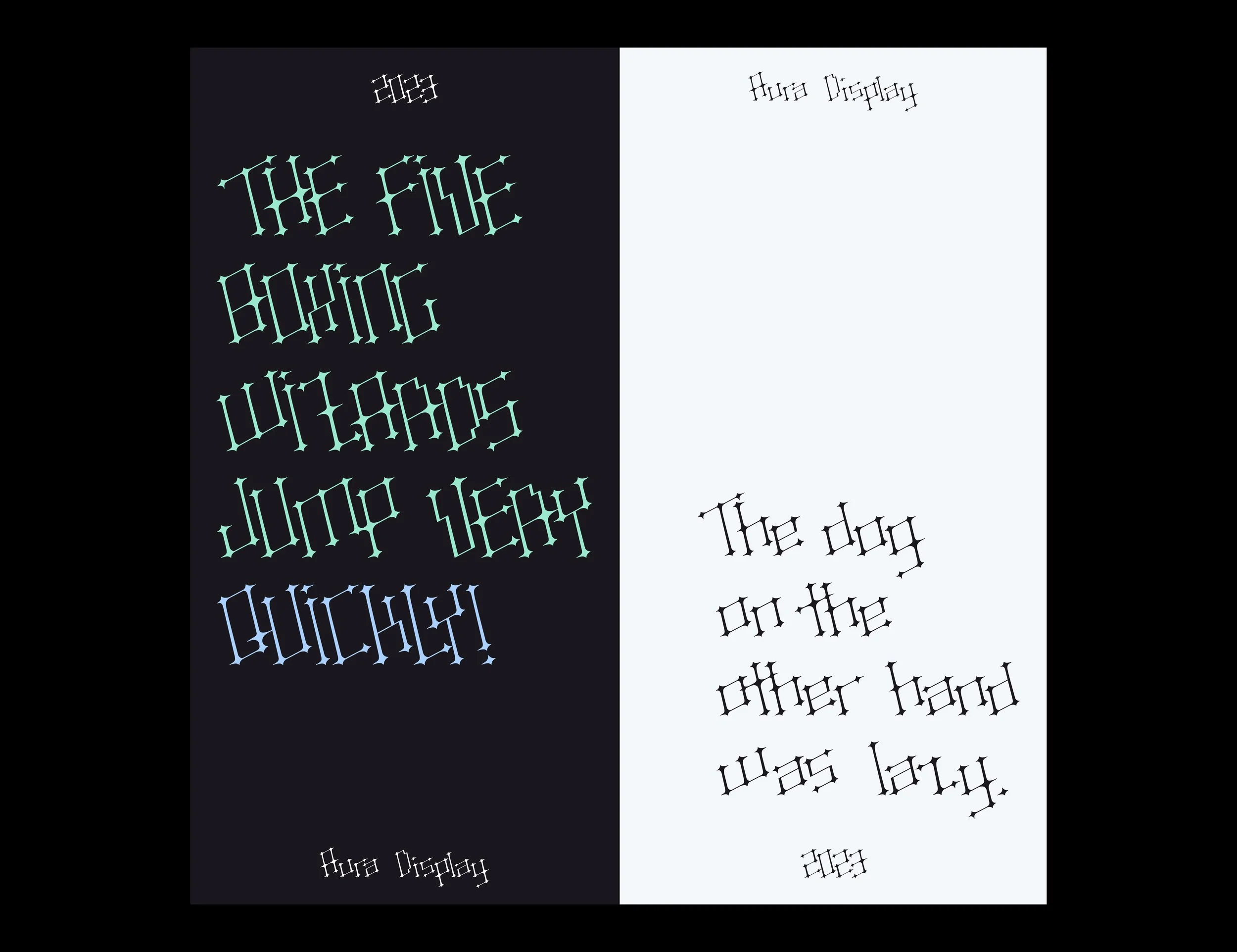
For my final type specimen, I was inspired to do a vertical pamphlet format, since the original reference for my font was created in a very vertical manner (on the human body). I also took inspiration from typeface designer, Gwennina Moigne, and her type specimen for the font “Souffle”.
Much of my creative work revolves around my personal interest in traditional art and tattoos, and so the ideation of my typeface sparked from the San Francisco-based artist, Saint (@thankyousaint), and their very personalized tattoo style. Saint’s work focuses on using the anatomy of a person’s body as an “underpainting” for the artwork that they directly draw on the skin. Using this process and style, I began with using a generic sans serif font as a skeleton to sketch my font onto.
I took further inspiration for the system of my font from angular modular fonts such as those you’d see on clocks or scoreboards, such as Radioland
Radioland FontProcess
The speedy, four-week process, of designing Aura Display consisted of initial research and repetitive iteration to reach the final product. As this was my first go at type design, I looked for inspiration for the typeface from things around me that I enjoy such as art, shows, movies, etc.
Through iteration and critique, I was able to make improvements to my font where there were originally inconsistencies and imbalances. For this project, we printed samples of our font to allow us to get a closer look at the imperfections of the font. Letters that especially challenged me were letters that contained diagonals, for example, “X” and “K”, for my font does not contain the diagonal strokes in the directions that the letterforms would traditional follow. I had to implement different “quirks” and variations to certain letterforms to allow the font to follow the rules I’d set.
Since I knew I wanted Aura to mainly be constructed from two alternating diagonals, I began by sketching on top of an existing typeface to give the typeface a general sense of balance and proportion. To make my process easier, I worked on the letters in the order of how each letterform is usually constructed:
Letters that only use straight lines
Letters that use straight lines and curves
Letters that use only curves
Letters that use only diagonals
Following the first round of critique, I started arranging my letterforms in various ways to test their uniformity and rhythm. For round two of the critique, I paired uppercase and lowercase letters together to ensure I had enough variability between the two to ensure their distinguishability. I also began putting my letterforms into sentences, in both all-caps and sentence case. This allowed me to see what letterforms threw off the rhythm of the reading experience and I was able to adjust accordingly.


